

We visited fast food restaurants to test how real-life users experience ordering through their websites.
This is part three of our multi-part series on usability with fast food eCommerce websites. In each part, we’ll highlight the usability problems and successes we discovered through performing guerrilla user testing(1) at popular fast food restaurant locations.
We’ll also offer suggestions on improving each website for higher conversions and customer satisfaction.
Restaurants have some of the highest conversion rates in the industry(2), complex menus with lots of options, bundling, and pricing configurations. This series will educate you about fast food’s successes and failures. Let’s get started!
Case Study: Chipotle Mexican Grill Mobile Website
![]()
In this part of our series, we study how users order on Chipotle's Mobile Website. By testing and evaluating how users navigate the site, we will discuss some of the biggest problems and explore suggestions on how we would solve each issue.
Usability Issue: Error Message
The first usability issue is an error message displayed when all required fields are not selected. This appears after the user picks the "Add to Bag" button.
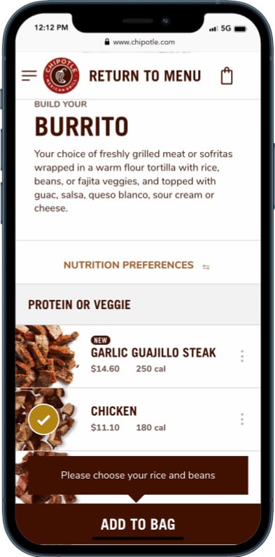
To fix the errors, users must scroll through a long list of items and find the sections that require attention. Having a long list of items, the error message alone is not helpful in quickly locating the unchecked options. This creates confusion and makes it harder to identify and correct the problem.
See the video of a user reacting to the error message.
First Solution: Pre-Populate Required Options
KFC's solution is to pre-populate any required secondary options with the most common choices. The process is typically used on other sites when the user picks an item with many secondary options. Users can process the order faster with fewer errors by having secondary options pre-selected.
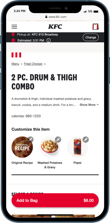
On the Chipotle site, an error message appears suggesting the user has made a mistake which is not the best user experience. Other design options and interface choices can correct this. Receiving an error message in the process of placing an order lowers conversions.
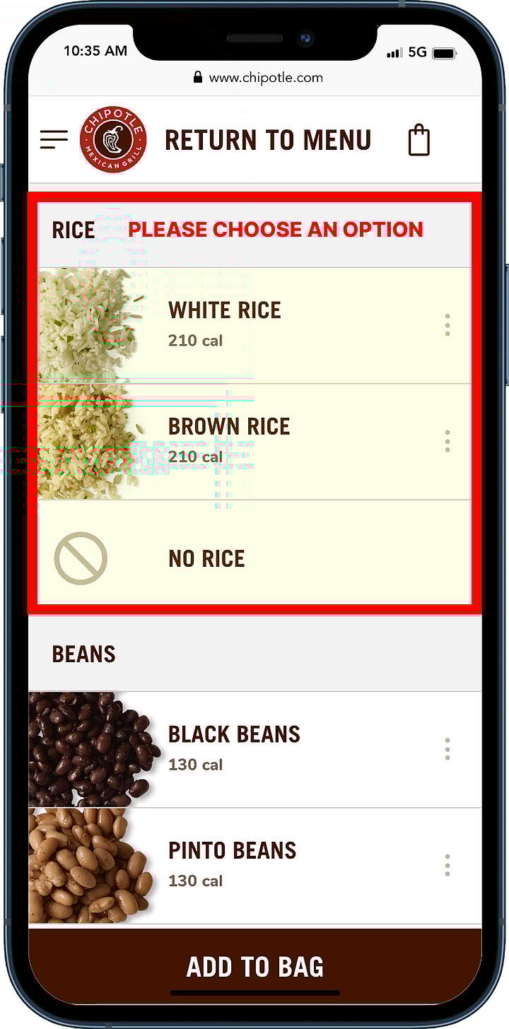
Second Solution: Highlight Errors
Another easy fix would be highlighting and displaying the section that requires attention. This allows users to find the areas or items that caused the error quickly, creating a positive ordering experience(7) and lessening site abandonment.
View a mockup of the error highlighted area
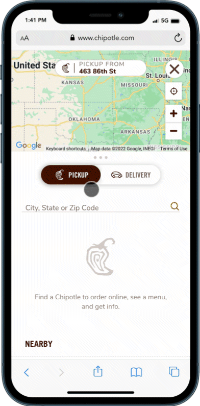
Usability Issue: Hidden Button
The following usability issue is the “Tap the target to find the closest Chipotle ” button on the page's bottom.
When the page is opened on a typical mobile screen, the “Tap the target to find the closest Chipotle ” button is hidden. Having the button located far away from the search field creates confusion and makes it harder to use.
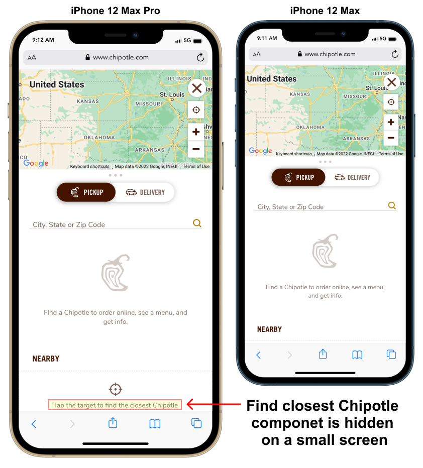
A second "Use My Location" component is displayed at the top of the search results. This component is hidden until the user types three characters into the search field.
See the user typing into the search field, which displays a"Use my location" component in the results.
Watch this video of a user finding the closest location.
Solution: Place Button Close to Search Field
A competitive example of solving the issue is the Five Guys site, which has a component that quickly allows users to search using the current location. The closest locations are displayed below when a user clicks the “Use My Location” button. The nearest location is highlighted, speeding up the ordering process and raising conversions.
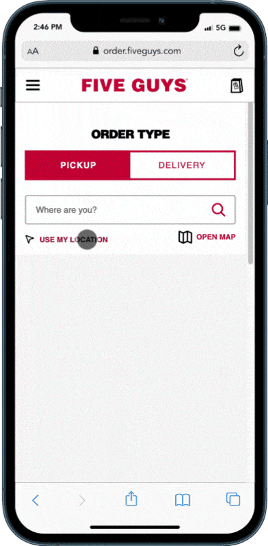
On the Chipotle site, the hidden “Tap the target to find closest Chipotle” button could be corrected by moving it next to the Search field. The second “Use My Location” displayed at the top of the search results could be removed.
The practice of placing elements in close proximity which share similar functionality is related to the Law of Proximity(3) from Gestalt psychology.
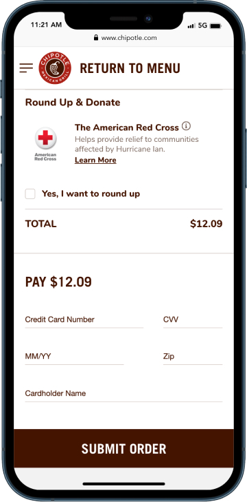
Usability Issue: Only Credit Cards Allowed
Users can only pay by credit card on the Chipotle site. This issue creates user frustration for anyone with other payment services set up on their phone. Chipotle slows the ordering process and lowers conversions by limiting payment options.
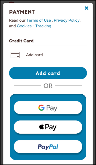
Solution: Allow More Payment Options
A good solution would be adding other payment options such as Google pay, Apple Pay, and PayPal. Since 2020 mobile payments have increased by 27.9% from $1.54 trillion. According to projections(6), the market will continue growing at 29.1% annually over the next seven years, eventually reaching $11.83 trillion by 2028. Limiting users’ payment options, Chipotle creates an opportunity for other services that users may find quicker and easier to use.
By removing these remaining obstacles from the users’ ordering journey, Chipotle will speed up the checkout process and create a more seamless experience. Creating a positive ordering experience(7) will give users a strong impression long after leaving the site.
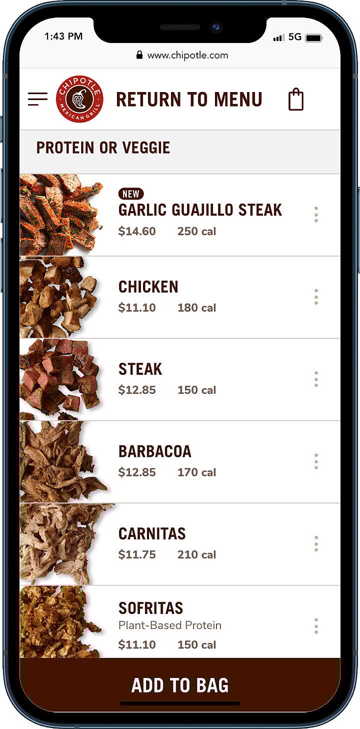
🥳Usability Success 1: Additional Options
An excellent example of successful usability is Chipotle product customization, the three-dot menu or "Kebab" shown on the right side of some options. It is a great method to keep the interface simple and allow users to expand more options if required.
The three-dot menu gives users an Information Scent(x) with interest in exploring what additional choices are available. This allows for personal choice and processing orders quickly with less confusion.
The three-dot menu is an excellent example of how UX design and visual-design principles(9) can improve customer satisfaction for a fast food eCommerce site.
Watch as a user quickly changes options with the three-dot menu.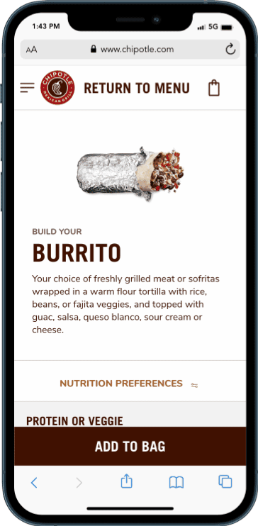
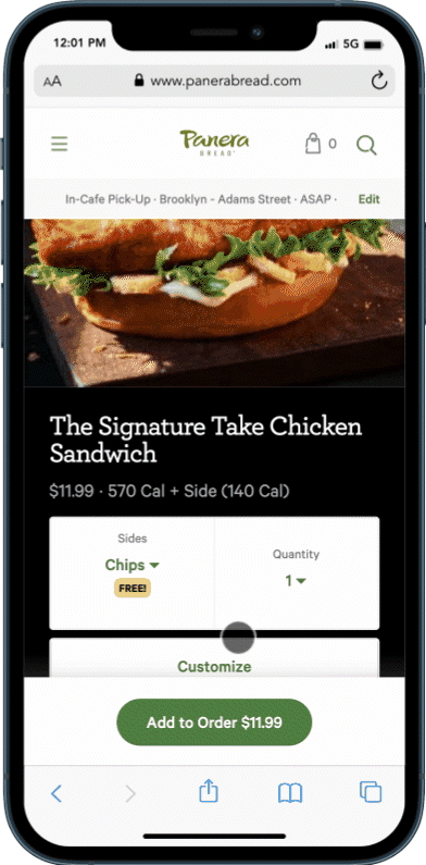
On the Panera Bread mobile website, it’s more difficult for users to customize additional options for a product. The users must navigate multiple clicks and different interfaces to accomplish this task. In comparison, Chipotle can deliver all the various options on one screen.
Watch as a user changes options through a multistep process.
😀😀Usability Success 2: Eating with Our Eyes
Another area of success is Chipotle's menu, which displays each food item with an attractive image. Many studies have proven that we are scientifically drawn to something that looks appetizing(x). Utilizing the left side of every menu item with an image of that choice, they entice users to make the most visually appealing choice, which drives up sales.
Conclusion
We discussed three ways Chipotle could improve its site:
- When users fail to select all required options on a product, an error message is displayed. It is better to have items preselected with the most popular choices.
- Improve the placement of the “Share Location” button at the bottom of the page, which is hidden on smaller screens.
- Accept forms of digital payments that are easy to use: Apple Pay, Google Pay, etc.
If you have questions or there are other sites that you want to see us discuss, put them in the comments section or tweet us.
Footnotes:- NOT CORRECTED
-
- Lade Tawak: A beginner’s guide to guerrilla research: Oct 18, 2019. Accessed on:Sept 11, 2022: [Online]. Available: https://www.invisionapp.com/inside-design/a-beginners-guide-to-guerrilla-research/
- Unbounce.com: conversion-benchmark-reports: Accessed on Sept 11, 2022: [Online]. Available:https://unbounce.com/conversion-benchmark-report
- Law of Proximity: Accessed on Sept 11, 2022 [Online]. Available:https://lawsofux.com/en/law-of-proximity/
- Shopping Cart Abandonment Rate: Accessed on: Sept 11, 2022 [Online]. Available:https://www.geckoboard.com/best-practice/kpi-examples/shopping-cart-abandonment
- Amy Schade: Don’t Force Users to Register Before They Can Buy: July 5, 2015: Accessed on Sept 11, 2022 [Online]. Available: https://www.nngroup.com/articles/optional-registration/
- Keith Hodges: August 24 2022: 22 Mobile Payment Statistics Detailing the Industry’s Growth: Accessed on Sept 11, 2022 [Online] Available:https://moneytransfers.com/news/content/mobile-payment
- Lexie Kane: The Peak–End Rule: How Impressions Become Memories: December 30, 2018: Accessed on Sept 11, 2022 [Online]. Available: https://www.nngroup.com/articles/peak-end-rule/
- Kelley Gordon: Visual Hierarchy in UX: Definition: January 17, 2021:Accessed on Sept 11, 2022 [Online]. Available:
https://www.nngroup.com/articles/visual-hierarchy-ux-definition/ - Kelley Gordon: 5 Principles of Visual Design in UX: March 1, 2020:Accessed on July 11, 2022 [Online]. Available: https://www.nngroup.com/articles/principles-visual-design
- Lade Tawak: A beginner’s guide to guerrilla research: Oct 18, 2019. Accessed on:Sept 11, 2022: [Online]. Available: https://www.invisionapp.com/inside-design/a-beginners-guide-to-guerrilla-research/